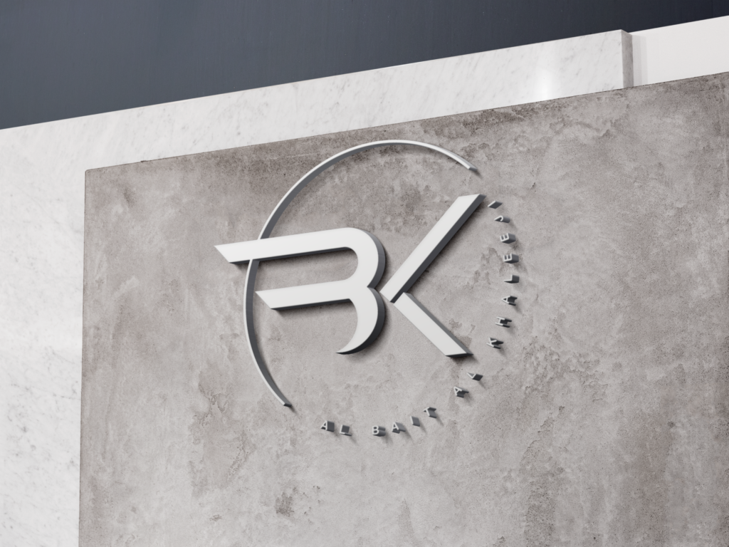
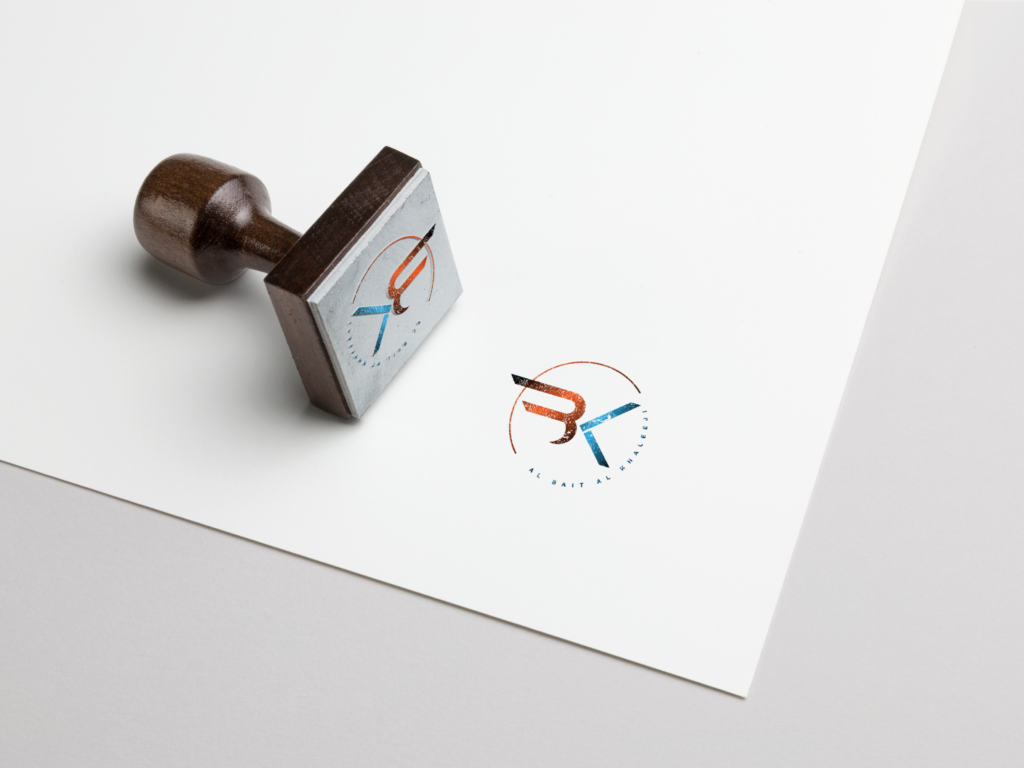
I designed the primary logo and cohesive brand identity for Al Bait Al Khaleeji to establish a strong, recognizable digital presence for the company. The project involved setting clear visual guidelines, including typography and color palettes, to ensure seamless consistency across all recurring promotional materials. By tailoring the overall aesthetic to align with regional market preferences, the new visual identity successfully resonated with the local UAE audience.
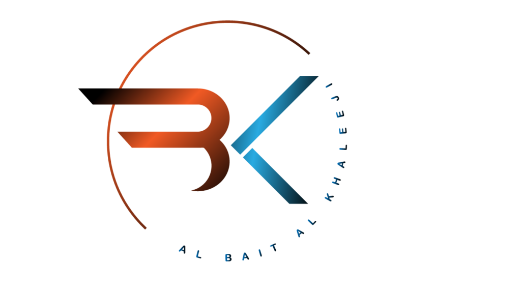
Designed a dynamic, geometric monogram blending the letters 'B' and 'K'. The extended, sweeping horizontal lines of the 'B' paired with the sharp, detached angles of the 'K' create a modern emblem that suggests forward momentum and growth.
Utilized a high-contrast, metallic gradient palette. The warm copper and burnt orange tones reflect the region's dynamic energy and heritage, while the contrasting cool teal and deep blues represent trust, stability, and corporate professionalism.
Selected a clean, modern sans-serif typeface with wide letter spacing (tracking) for the primary English text to convey a premium, established feel. The dual-language lockup smoothly integrates the Arabic text below a sleek, two-toned divider line, ensuring perfect cultural alignment and readability across the UAE market.